↓
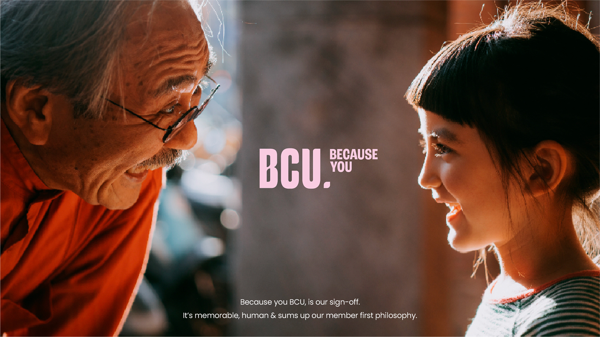
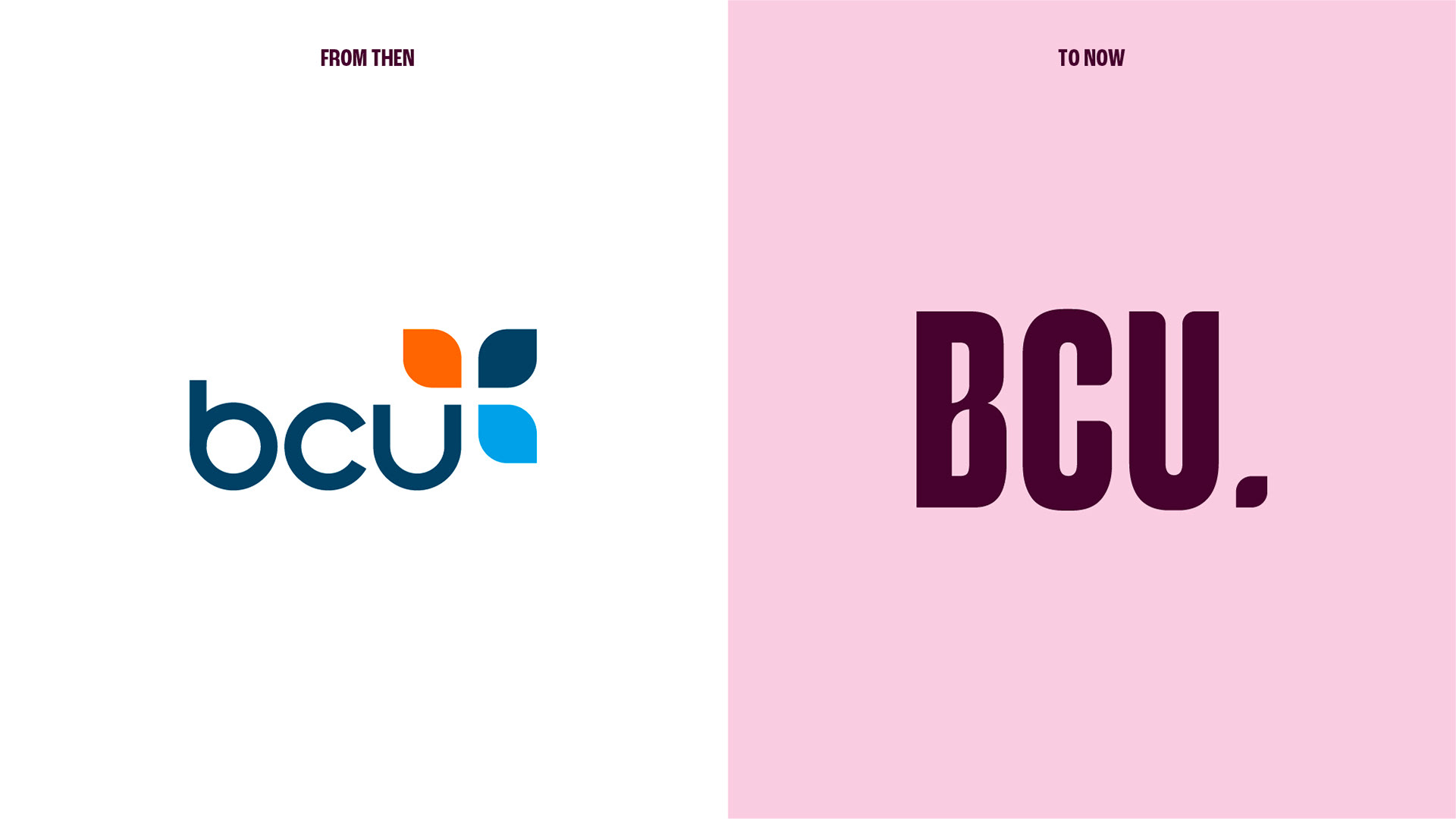
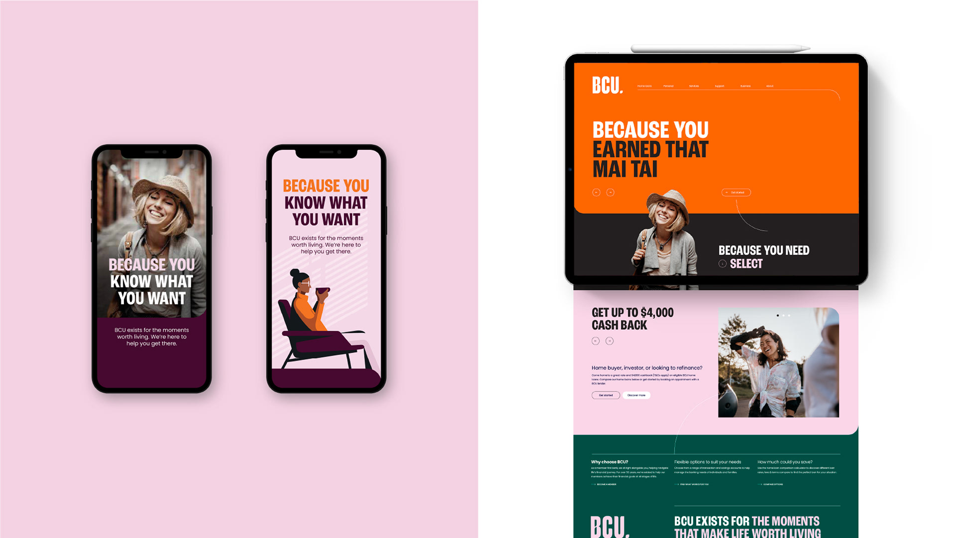
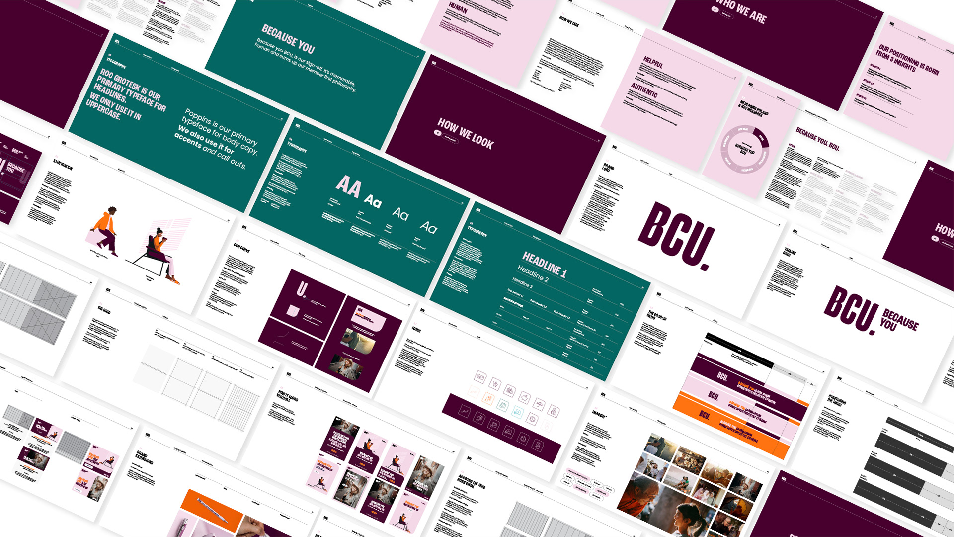
BCU’s new visual identity draws from its Banana Coast heritage and puts members at the heart of the story. Inspired by the banana leaf, the design language focuses on people—not products.
As a member-owned bank, BCU is built on integrity, positivity, and devotion. Its personality is human, authentic, quick-witted, and tenacious—breathing new life into the brand and strengthening its bond with members.
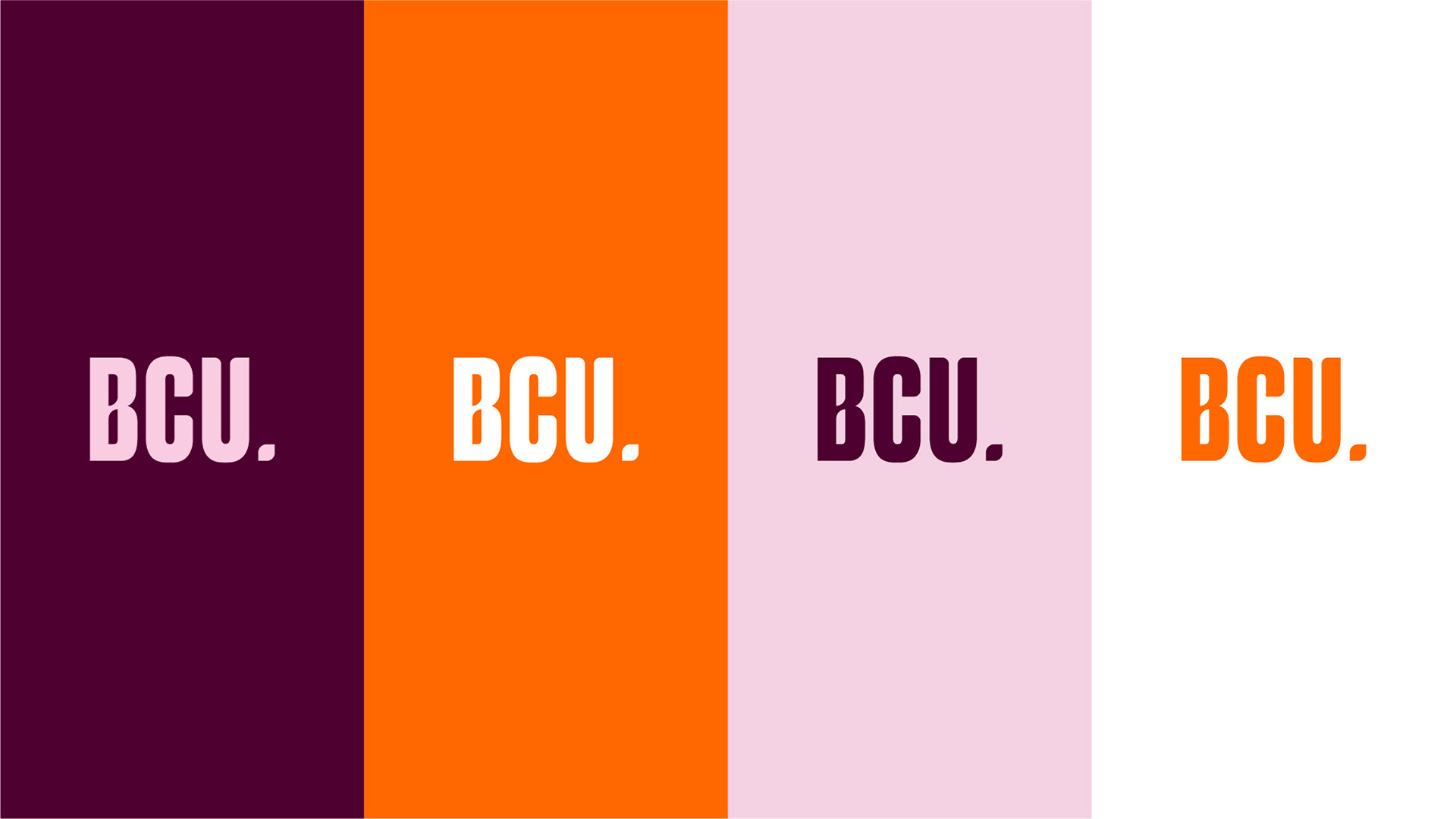
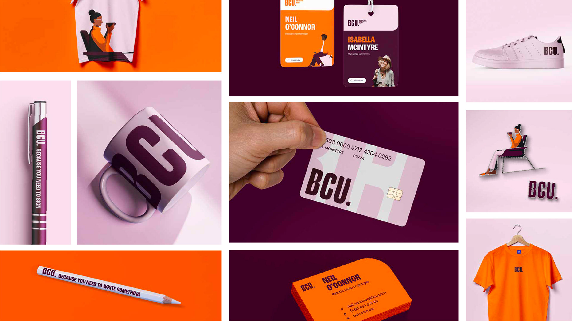
The identity is bold yet warm: headlines feel human, colours echo the Australian sunset, and illustrations balance wit with depth. A flexible brand device, the curve, derived from the logo, unifies the system—appearing in everything from campaign assets to icons as a subtle nod to heritage.
Together, these elements create a brand that honours its past, connects deeply with members, and confidently shapes the future.
↖ ALL PROJECTS
↖ ANOTHER PROJECT